Calm app
Product designer & Design Engineer | TryCalm.app | 2026
Your quiet corner of the internet, saved on your mac.
I have a folder on my Mac called Saves, it has over 500 images on it. I haven't opened it in months.
As a designer I save constantly. Articles, design references, ideas that felt important at the time. They're all in there somewhere, buried under everything I saved after them.
The problem isn't saving. Saving is easy. Every app makes saving easy. The problem is what happens after. You save something and it disappears into a pile. The pile gets bigger. Eventually you stop trusting the pile and you stop going back to it.
So you save the next thing somewhere else. A new Note. A new folder. A new app that promises to be different. It never is.
I wanted something simpler. My own quiet corner of the internet. Somewhere things I save actually feel mine — without the overhead of organising, tagging, or maintaining it.
So, I built Calm.
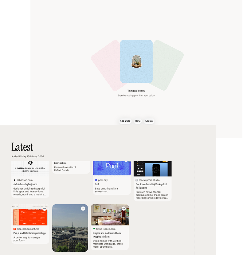
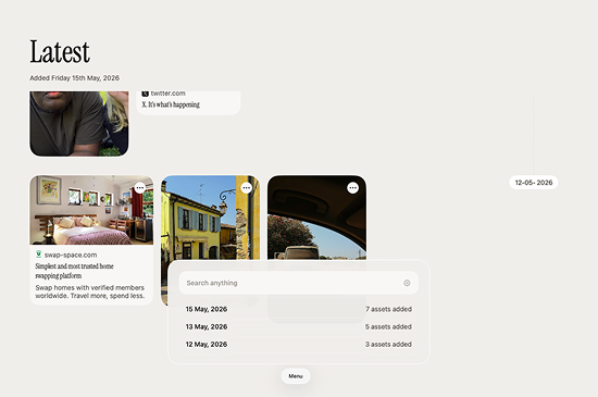
It lives on your Mac. Nothing leaves your machine. Hit a shortcut, drop a link, an image, a PDF, whatever caught your eye, and it's there. Sorted by date. Instantly searchable. That's it.
No account. No cloud. No pile you'll never go back to.
Building Calm
Calm has been the most enjoyable personal project I've worked on. I had a clear feeling for what I wanted it to be from the start and it lives up to its name.
I wanted the whole experience to feel considered, from the first screen you see to the sound that plays when you open it. The onboarding needed to feel like an arrival, not a setup process. So I spent time on the logo animation, the ambient music, the gradient that shifts slowly behind everything like light through a window.
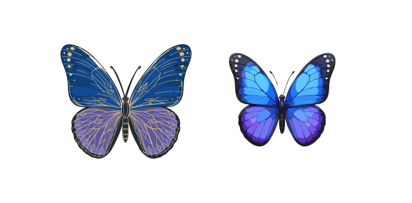
For the icon I sketched a few butterfly illustrations in Figma and refined the final version in QuiverAI. The butterfly isn't incidental. It's something that lands quietly, stays briefly, and leaves an impression. That felt right for an app about things worth keeping.
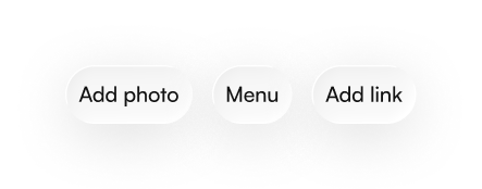
Capture anything, out of the way
The main view is three buttons. Add photo. Menu. Add link.
That's the whole app surface. No sidebar, no toolbar, no settings panel demanding attention. The most important actions are right there and everything else stays hidden until you need it.
I wanted Calm to feel like it's not really there, until you need it. Then it's exactly where you left it.
Search
Most bookmark apps make you do the work upfront. Tag it, categorise it, file it somewhere sensible. The assumption is that future you will thank present you for the effort.
Present you never does the effort. So future you finds nothing.
Calm doesn't ask you to tag anything. You save it and it's there, sorted by the date you saved it. The search bar at the top of the menu searches everything instantly as you type. Titles, URLs, file names. No filters, no dropdowns, no query syntax to learn.
It's the kind of search that gets out of your way.
Anthropic layer
One thing I wanted to solve was images. A link has a title. A PDF has a file name. An image has nothing. It just sits there, unsearchable, unless you remember exactly when you saved it.
So I added an optional Anthropic layer. Drop in your API key and Calm will quietly generate a description for every image you save. A screenshot of a colour palette becomes searchable as "muted sage and blush tones." A photo of a building becomes "brutalist concrete facade, natural light."
The key lives on your Mac. It never touches a server. It's the same local-first principle the whole app is built on, just with a layer of intelligence on top for the people who want it.
You don't have to use it. But once you do, your image library becomes as searchable as everything else.